~ 13 min read
Rapid Data Visualization and Interactivity with Streamlit

Photo by Clay Banks via Unsplash
Rapid Data Visualization with Python
The Python library Streamlit allows you to take your data and create a shareable, interactive data visualization rapidly, and in pure Python. The basic premise is to wrap your Python script between some pre-defined Streamlit commands and then run the entire thing from your terminal. With that being said, you are therefore able to take advantage of Python’s fantastic data manipulation ecosystem to wrangle and work with your data - so libraries like pandas and numpy can all be used if needed.
Data set
Data Source
Regarding the data set - at face value - in this article I’ll be basing the data set on a Kaggle Twitter US Airline Sentiment data set that is freely available. This data set analyzes how travelers in February 2015 expressed their feelings on Twitter.
A sentiment analysis job about the problems of each major U.S. airline. Twitter data was scraped from February of 2015 and contributors were asked to first classify positive, negative, and neutral tweets, followed by categorizing negative reasons (such as “late flight” or “rude service”).
However, I’ll actually take this opportunity to use another Python library, named Faker, to recreate an equivalent version of the Kaggle data set just mentioned. That is to say, we’ll create a fake data set that contains the same fields as the data you’d find in Kaggle, except for the fact that in this article the data values themselves will be created with the Faker Python library.
Data Features
We still turn to the original Kaggle data source to understand the individual features of the data set we’ll be using. I’ll be using only 12 of the 15 available fields, namely:
tweet_id- an ID that uniquely identifies the Tweet i.e. uniquely identifies that row of data.airline_sentiment- a string that reflects the customers view of the airline. Available choices are “Negative”, “Neutral”, or “Positive”. No further information is available but it appears that these are the output of a classification model run elsewhere in order to produce the data.airline_sentiment_confidence- a floating point value between 0.0 and 1.0 that reflects the confidence in whatever classification model was used to determine theairline_sentimentfield.negativereason- another output from some unseen and unavailable classification model that gives a reason (as a string) as to why the customer may have scored the airline so poorly.negativereason_confidence- a floating point value between 0.0 and 1.0 that reflects the confidence in whatever model was used to determine thenegativereasonfield.airline- airline name; string.name- customer name; string.retweet_count- an integer count of how often this particular Tweet has been retweeted.text- text context of the Tweet itself.tweet_created- datetime of when the Tweet was first written.latitude- the latitude of the mobile phone from which the tweet was tweeted.longitude- the longitude of the mobile phone from which the tweet was tweeted.
Faked Data
To create a fake data set with the above listed features I’m using the Python library Faker. As it states in their documentation, Faker is a Python package that generates fake data for you.
Installation is via the typical pip command:
pip install Faker
Then we implement a faker generator from which fake data can be generated by accessing “Providers”, which are sub-classes of the parent Faker object.
# Import the parent Faker class.
from faker import Faker

# Initialize a Faker object instance.
fake = Faker()
So for example, if we wished we could now use the faker.providers.person sub-class, which is a generator, to generate fake names (e.g. fake customer names). But moreover, this particular sub-class has methods attached that allow us to be more specific about the actual name that is generated. For example the first_name() method will return a randomly generated first name. While the methods first_name_female() and first_name_female() will randomly generate first names for females and males, respectively.
And this hierarchy of parent Faker class, with “Provider” sub-classes, that in turn provide convenience methods, allows us to generate all the features of the original Kaggle data set.
I must admit however, I also turned to the built-in library random for certain sections of the following code!
Nonetheless, the following describes the code sections that will generate the necessary fake data.
# Assuming we've already imported and initialized the Faker class .
# As shown above.

# Import the built-in library 'random'.
import random

# Let's create a dataset with 200 rows of data.
rows_of_data = 200
Tweet ID
We use set() and the .unique attribute of the Faker instance fake here to ensure that the IDs of the tweets i.e. of the individual rows of data, are guaranteed to be unique.
tweet_id = set(fake.unique.ssn() for i in range(rows_of_data))
Airline Sentiment
We create a list here because we aren’t worried about having duplicate sentiment values. It’s perfectly possible for multiple customers to give the same category for this feature. Beyond that, notice how we provide the three possible options to Faker, and asked it’s fake.random_element Provider to randomize the selection made. And so by virtue of placing this within a list comprehension we can ask Faker to create as many random answers as we need.
airline_sentiment = [
    fake.random_element(elements=('Positive', 'Neutral', 'Negative')) for i in range(rows_of_data)
]
Airline sentiment confidence
airline_sentiment_confidence = [
    round(random.uniform(0.0, 1.0), 3) for i in range(rows_of_data)
]
Negative Reason
negative_reason = [
    fake.random_element(elements=(
        '', 'Bad flight',
        'Cancelled flight', 'Customer service issue',  'Damaged luggage',
        'Late arrival', 'Late departure', 'Lost luggage',
        'Rude staff', 'Lost booking'
    )) for i in range(rows_of_data)
]
Negative Confidence
negative_confidence = [
    round(random.uniform(0.0, 1.0), 3) for i in range(rows_of_data)
]
Airline
airlines = [
    fake.random_element(elements=(
        'Virgin Atlantic', 'British Airways',
        'Emirates', 'AeroMexico',  'KLM',
        'Air France', 'US Airways', 'Lufthansa',
        'Iberia', 'Delta Airlines'
    )) for i in range(rows_of_data)
]
Customer Name
We use set() again here because we’d prefer to have each row of data come from a unique customer.
customer_name = set(fake.name() for i in range(rows_of_data))
Retweet count
retweet_counts = [random.randrange(0, 1000) for i in range(rows_of_data)]
Tweet text
Here I allow the Tweet length to range from a minimum of 10 words to a maximum of 30 words. This way the data size won’t get out of hand but will still have sufficient randomization to work with.
tweet_text = set(
    fake.sentence(nb_words=random.randrange(10, 30)) for i in range(rows_of_data)
)
Tweet datetime
tweet_datetime = [fake.date_time() for i in range(rows_of_data)]
Tweet latitude and longitude
This will choose latitudes and longitudes specifically from continental USA - this way we can focus any mapping visualization on a restricted area (rather than the entire globe).
tweet_location = [
    fake.local_latlng(country_code='US', coords_only=True) for i in range(rows_of_data)
]
Save as a CSV
Finally, let’s take all the data variables we’ve created, turn them into a Pandas DataFrame, and save this to a CSV file.
import pandas as pd

# Create a DataFrame containing all the column names and features for our data set.
faked_data = pd.DataFrame(
    list(zip(
        tweet_id,
        airline_sentiment,
        airline_sentiment_confidence,
        negative_reason,
        negative_confidence,
        airlines,
        customer_name,
        retweet_counts,
        tweet_text,
        tweet_datetime,
        tweet_location)),
    columns=[
    'ID', 'Sentiment', 'Sentiment Confidence', 'Reason', 'Reason Confidence',
    'Airline', 'Customer Name', 'Retweet Count', 'Tweet text', 'Tweet Datetime',
    'Tweet Location'
    ]
)

# Save the data set to a csv file ready to be used in Streamlit.
faked_data.to_csv("tweet_data.csv", index=False)
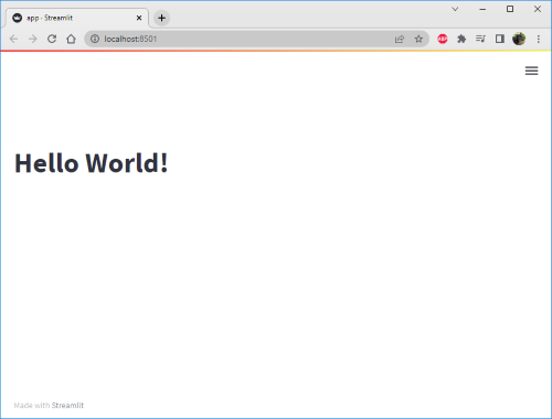
”Hello World!” with Streamlit
It’s wonderfully quick to get started with Streamlit. First of course we must install it into our virtual environment, using pip install streamlit. Next, create an empty Python script file named app.py. Finally, it’s simply a case of importing the main streamlit class and then calling the properties and/or methods of this class.
import streamlit as st

st.title("Hello World!")
Your default browser should automatically open at the address http://localhost:8501 and you should see the following:
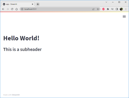
Now if we add the following line to our code, save the file, and then head back to the browser, we’ll see that a couple of things have happened:
st.subheader("Here is a subheader element")
Firstly you’ll notice that towards the top right hand corner a pop-out menu lets you update the browser either manually, or for Streamlit to update it for you automatically whenever changes are made in the source file(s).
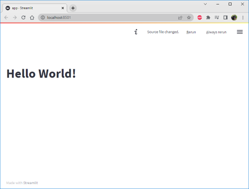
If you select the “Always rerun” option, the browser will automatically update to show the new subheader we’ve just added.
You may also notice how quickly Streamlit updated. This is one of the advantages of using the Streamlit library, which is that it understands the particular components that have been updated from one refresh to the next and intelligently chooses only to send the differences required to implement the updates.
The Streamlit API
Text Methods
To really get an idea of how straightforward Streamlit is to use it’s a good idea to take a look at the api within the wider documentation. Here for example you’ll see how adding text methods, just like those demonstrated above, is rather trivial.
Specific text methods to call upon include:
st.title("Display text in a title style of formatting")st.header("Display text in a header style of formatting")st.subheader("Display text in a subheader style of formatting")st.markdown("Allows you to use markdown style formatting **directly** within the sting")
Data methods
The above ease with which we could create text methods extends to methods specifically designed for data. So for example we can display a pandas DataFrame with st.dataframe(my_data_frame). Or we could pull out specific metrics to draw attention to them for example if they indicated some sort of headline figure. For example st.metric("My label").
And all the rest
Most of the other methods available with Streamlit follow exactly the same style of implementation as the data and text methods.
- Chart - for example
st.line_chart(my_data), which accepts pandas DataFrames, NumPy arrays, iterables and dictionaries. - Input - for example
st.button('Click me'), which accepts functions to be used as callbacks once the button is clicked, as well as space for arguments to send back to that callback. - Media - for example
st.image(file)allows you to include images - whilest.audio()andst.video()perform exactly as you’d expect. - Layouts and containers - methods such as
st.expander(),st.container(), andst.columns()let you structure you dashboard however you wish. With Streamlit performing all the sizing and restructuring necessary as your screensize changes.
Build our Streamlit Dashboard
With the above whistle-stop introduction to Streamlit complete, now lets begin building out the structure of our dashboard for the Kaggle Twitter data we created earlier.
Structure
import streamlit as st
import pandas as pd
import numpy as np
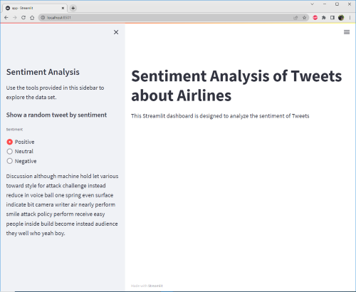
st.title("Sentiment Analysis of Tweets about Airlines")
st.sidebar.title("Sentiment Analysis")
st.markdown("This Streamlit dashboard is designed to analyze the sentiment of Tweets")
st.sidebar.markdown("Use the tools provided in this sidebar to explore the data set.")
Notice in the above how we can chain methods together, much like you can in NumPy and Pandas. Thus for example, within the context of st.sidebar(), which is a layout method, we can then chain on a title or a markdown method to further define that we want those titles, or markdown, or whatever, to be contained within the sidebar.
Data Caching
Although Streamlit will intelligently update the dashboard whenever changes are made, either to the source code or to the inputs available on the dashboard itself, it still makes sense to cache our data source. In this way we won’t be constantly constantly asking Streamlit to reload the data everytime a dashboard input or functionality is used.
Thus, with the tweet_data.csv data we created above, let’s read that into a pandas DataFrame and cache the result so Streamlit only needs to do it once per app load.
@st.cache(persist=True)
def load_data():
    data = pd.read_csv("tweet_data.csv")
    data['latitude'] = data['Tweet Location'].apply(lambda x: float(x.split("'")[1]))
    data['longitude'] = data['Tweet Location'].apply(lambda x: float(x.split("'")[3]))
    data['Datetime'] = data['Tweet Datetime'].apply(lambda x: pd.to_datetime(x))
    return data


df = load_data()
User Inputs and Selections
Now that we have made our data available to Streamlit we can also give the user choices as to which data they wish to see. So for example, in the below we add some radio buttons to the sidebar that allow the user to randomly select a Tweet based on the sentiment of that Tweet (“Positive”, “Neutral”, or “Negative”).
st.sidebar.subheader("Show a random tweet by sentiment")
random_tweet = st.sidebar.radio(
    'Sentiment', ('Positive', 'Neutral', 'Negative')
)
st.sidebar.markdown(
    df.query('`Sentiment` == @random_tweet')["Tweet text"].sample(1).iloc[0]
)
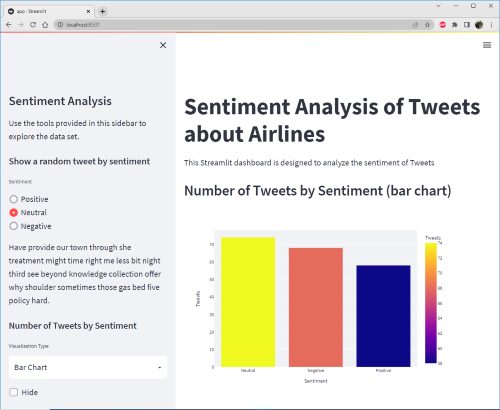
Charting
Ok, now let’s introduce basic charting to our application. We’ll integrate the Plotly Express plotting library (pip install plotly) to create plots of the tallys of the sentiment data. But furthermore, lets also place a dropdown in the sidebar to give the user the option of generating either a bar chart or a pie chart out of those sentiment data tallys.
st.sidebar.markdown('### Number of Tweets by Sentiment')
select = st.sidebar.selectbox('Visualization Type', ['Bar Chart', 'Pie Chart'], key='1')

df_sentiment_count = df['Sentiment'].value_counts()
df_sentiment_count = pd.DataFrame(
    {'Sentiment': df_sentiment_count.index,
     'Tweets': df_sentiment_count.values}
)

if not st.sidebar.checkbox("Hide", True):
    if select == "Bar Chart":
        st.markdown("### Number of Tweets by Sentiment (bar chart)")
        fig = px.bar(df_sentiment_count, x='Sentiment', y='Tweets', color='Tweets', height=500)
        st.plotly_chart(fig)

    else:
        st.markdown("### Number of Tweets by Sentiment (pie chart)")
        fig = px.pie(df_sentiment_count, values='Tweets', names='Sentiment')
        st.plotly_chart(fig)
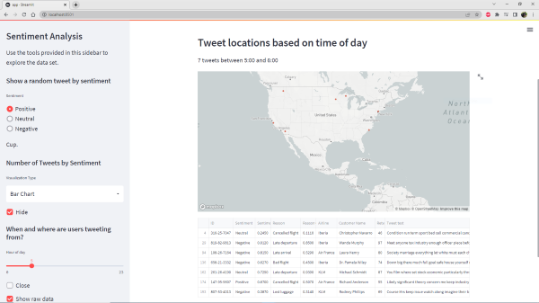
Mapping
To end this particular article, lets plot a map of the locations of users tweets. But, moreover, let’s give the user the ability to filter the data to only show those tweets over a user selected hour period.
st.sidebar.subheader("When and where are users tweeting from?")
hour = st.sidebar.slider("Hour of day", 0, 23)
modified_data = df[df['Datetime'].dt.hour == hour]

if not st.sidebar.checkbox("Close", True, key='1'):
    st.markdown("### Tweet locations based on time of day")
    st.markdown("%i tweets between %i:00 and %i:00" % (len(modified_data), hour, (hour+1)%24))
    st.map(modified_data)
    if st.sidebar.checkbox("Show raw data", False):
        st.write(modified_data)
Conclusion
You can see how straightforward it is to create complex data visualizations with very intuitive user controls. In a later article we’ll look at other data visualization libraries and ecosystems!