~ 13 min read
Hero Banner in React, Tailwind CSS, and Glidejs

Photo by Darren Chan on Unsplash
Introduction
In this post we’ll build a Hero Banner consisting of three images, that transition automatically from one to the other, with text overlaid. When we talk about a ‘Hero banner’ we’re usually refering to the landing page of a website - where, at or near the top of the page there may be a large image with some text overlaid. In fact often there will be more than one image, and after a set period of time the image being displayed will change to one of the others. Usually this occurs with some sort of animation (slide-in, fade-in, etc.), again after a fixed period of time, and in a cyclical fashion. Hence, the ‘Hero banner’, can contain images that relate to the business, individuals, or individual that the website represents with the overlaying text conveying a message that is in someway relevent to it’s location, perhaps including buttons that lead the user through to other content. And again this is usually placed at the top of the landing page. In this post I’ll walk through how such a ‘Hero banner’ can be made using React, Tailwindcss, and the JavaScript library Glidejs. Let’s get started!
React Project Setup
From within your chosen folder, and at the command prompt, type the command: npx create-react-app . (← the full stop here is deliberate).
Alternatively, from a parent folder type the command npx create-react-app myproject (← where myproject is whatever name you want for your project).
The distinction between the two commands noted above being that if you’ve already created the folder where you’d like your project to be setup, and you’ve cd’d into it, you can use the period (full-stop) to have create-react-app setup your new project there. Otherwise you’d need to nominate where the project will go. A minor distinction but one I thought worth mentioning.
On success you should see the following message within the command window.
Success! Created blog_article at C:\Users\myproject
Inside that directory, you can run several commands:

  npm start
    Starts the development server.

  npm run build
    Bundles the app into static files for production.

    Starts the test runner.

  npm run eject
    Removes this tool and copies build dependencies, configuration files
Compiled successfully!

You can now view blog_article in the browser.

  Local:            http://localhost:3000/
  On Your Network:  http://192.168.1.69:3000/

Note that the development build is not optimized.
To create a production build, use npm run build.
Tailwind install and setup
Tailwind install
For the majority of the CSS in this article, I’ll be using the package Tailwindcss https://tailwindcss.com/. Install this through npm with the command npm install tailwindcss.
Next, within the root folder, src, create a new folder named config. And then, inside src/config create a new file called tailwind.config.js.
Also, in the same src/config folder, create a file called tailwind.config.css. It is into here that we will place the @tailwind directives, which will then inject Tailwind’s base, components, and utilities styles into your CSS. At build time Tailwind will swap these directives out and replace them with all of its generated CSS.
root/src/config/tailwind.config.css
@tailwind base;

@tailwind components;

@tailwind utilities;
root/src/config/tailwind.config.js
module.exports = {
  theme: {
    extend: {},
    variants: {},
    plugins: [],
  },
}
Tailwind scripts in package.json
Introduce a new script into your package.json file that will build out the Tailwind CSS.
Notice how it makes reference to a css folder (src/css), thus make sure this exists first before running the command npm run dev:css to build out the Tailwind CSS.
After running the script you will have a file named tailwind.css in your root/src/css folder.
root/package.json
"scripts": {
  "start": "react-scripts start",
  "build": "react-scripts build",
  "test": "react-scripts test",
  "eject": "react-scripts eject",
  "dev:css": "./node_modules/.bin/tailwind build src/config/tailwind.config.css -c src/config/tailwind.config.js -o src/css/tailwind.css"
}
Top level components
Tidy up index.js
Take your src/index.js file and tidy it up a little.
For this tutorial we won’t be using a service worker - so we can delete that. Then, to start from a clean CSS base, open the file index.css and just delete everything our of it. Then move it to the src/css folder you created earlier.
Make sure you update src/index.js to inform it of the new location for index.css (import './css/index.css';).
Then, referring to the official create-react-app documentation - in particular the section on “Adding CSS Reset” (https://create-react-app.dev/docs/adding-css-reset#indexcss) you can, if you wish, underscore the fresh CSS base you’re working from by adding the command @import-normalize; to the src/css/index.css file.
root/src/index.js
import React from "react"
import ReactDOM from "react-dom"

import App from "./App"
import "./css/index.css"

ReactDOM.render(<App />, document.getElementById("root"))
Tidy up App.js
Take your src/App.js file and tidy it up a little.
For this tutorial we won’t be needing the logo.svg, nor App.css. So they can both be deleted.
Also, clean up the contents of the App component … so that it’s easier to work with.
root/src/App.js
import React from "react"

function App() {
  return (
    <div className="App">
      <header className="App-header">
        <h1>Hello world</h1>
      </header>
    </div>
  )
}

export default App
Introduce Tailwind css to the App
Take your src/App.js file and import the Tailwind css file (import './css/tailwind.css';).
Then, just to prove everything is working, add some Tailwind CSS markup to the h1 header.
root/src/App.js
import React from "react"

import "./css/tailwind.css"

function App() {
  return (
    <div className="App">
      <header className="App-header">
        <h1 className="bg-red-200 text-blue-600">Hello world</h1>
      </header>
    </div>
  )
}

export default App
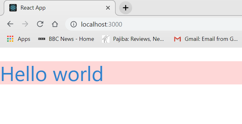
Run the development server to check everything works
Not pretty - but at least it proves everything is working as we’d expect!
The Hero Component
It’s customary to leave the App.js component at the top level - and create a hierarchy of components beneath it.
We’ll only need one component; firstly, create a folder called components inside of the src/ folder. Then inside there (src/components) create a new file called Hero.js. This will be the component in which we’ll create the hero banner.
If you are coding alongside this article, and you’re using VS code, then you can use the Emmet extension to create a boilerplate React class component for you. That is, at the top of the blank src/components/Hero.js file simply type the letters rcc and then press the tab key and the following React class component boilerplate should be created for you automatically.
root/src/components/Hero.js
import React, { Component } from "react"

export default class Hero extends Component {
  render() {
    return <div></div>
  }
}
Copy and paste the header fragment that we had previously placed in src/App.js into src/component/Hero.js and then in src/App.js import the Hero.js component - before, finally, calling it from within a React.Fragment element.
Thus src/component/Hero.js should now look like the following:
import React, { Component } from "react"

export default class Hero extends Component {
  render() {
    return (
      <div>
        <header className="App-header">
          <h1 className=‘bg-red-200 text-blue-600>Hello world</h1>
        </header>
      </div>
    )
  }
}
While src/App.js will look like this:
import React from "react"

import Hero from "./components/Hero"
import "./css/tailwind.css"

function App() {
  return (
    <React.Fragment>
      <Hero />
    </React.Fragment>
  )
}

export default App
After making the above changes you should see exactly the same output in the browser as we had before - it is simply that we have proved that we can shift the bulk of the functionality into it’s own component and away from the App.js parent component.
Apply Tailwindcss structure and styling to our Hero component
Now, in src/components/Hero.js, we’ll add some proper structure and styling to the page - and all with Tailwindcss.
root/src/components/Hero.js
import React, { Component } from "react"

export default class Hero extends Component {
  render() {
    return (
      <div className="container mx-auto h-auto flex flex-grow max-w-4xl">
        <header className="App-header">
          <h1 className="bg-red-200 text-blue-600">Hello world</h1>
        </header>
      </div>
    )
  }
}
This will shift the h1 tag into a container - that container will always be centered in the page - and it’s width will grow as the screen width does - up to the max-w-4xl limit, which is the Tailwindcss syntax representing the CSS expression max-width: 56rem;.
Introducing Glidejs
Setup
For the banner I’m using the package glide (https://glidejs.com/).
Install this through npm with the command npm install @glidejs/glide.
Import the core and theme glidejs CSS styles at the top of the src/components/Hero.js component.
root/src/components/Hero.js
import React, { Component } from "react"

import "../../node_modules/@glidejs/glide/dist/css/glide.core.min.css"
import "../../node_modules/@glidejs/glide/dist/css/glide.theme.min.css"

export default class Hero extends Component {
  render() {
    return (
      <div className="container mx-auto h-auto flex flex-grow max-w-4xl">
        <header className="App-header">
          <h1 className="bg-red-200 text-blue-600">Hello world</h1>
        </header>
      </div>
    )
  }
}
Prepare the main markup that will house Glidejs
Now from a React point of view (and therefore in the style of an ES module) we can take advantage of Glide’s modular build.
Thus, at the top of the src/components/Hero.jscomponent, we place the expression import Glide, { Controls, Autoplay } from '@glidejs/glide/dist/glide.modular.esm.js';.
root/src/components/Hero.js
import React, { Component } from "react"

import Glide, {
  Controls,
  Autoplay,
} from "@glidejs/glide/dist/glide.modular.esm.js"

import "../../node_modules/@glidejs/glide/dist/css/glide.core.min.css"
import "../../node_modules/@glidejs/glide/dist/css/glide.theme.min.css"

export default class Hero extends Component {
  render() {
    return (
      <div className="container mx-auto h-auto flex flex-grow max-w-4xl">
        <div className="glide">
          <div className="glide__track" data-glide-el="track">
            <ul className="glide__slides">
              <li class="glide__slide">0</li>
              <li class="glide__slide">1</li>
              <li class="glide__slide">2</li>
            </ul>
          </div>
        </div>
      </div>
    )
  }
}
Initialising Glide
Now, in terms of initializing Glide, and since we’re using a React class component, we setup a couple of lifecycle methods and define a state object.
root/src/components/Hero.js
import React, { Component } from "react"

import Glide, {
  Controls,
  Autoplay,
} from "@glidejs/glide/dist/glide.modular.esm.js"

import "../../node_modules/@glidejs/glide/dist/css/glide.core.min.css"
import "../../node_modules/@glidejs/glide/dist/css/glide.theme.min.css"

export default class Hero extends Component {
  state = {
    glide: 0,
  }

  componentDidMount() {
    this.setState(state => {
      state.glide = new Glide(".glide", {
        type: "slider",
        autoplay: 3000,
        gap: 0,
        rewindDuration: 0,
        animationDuration: 0,
      }).mount({ Controls, Autoplay })
    })
  }

  componentWillUnmount() {
    this.state.glide.destroy()
  }

  render() {
    return (
      <div className="container mx-auto h-auto flex flex-grow max-w-4xl">
        <div className="glide">
          <div className="glide__track" data-glide-el="track">
            <ul className="glide__slides">
              <li class="glide__slide">0</li>
              <li class="glide__slide">1</li>
              <li class="glide__slide">2</li>
            </ul>
          </div>
        </div>
      </div>
    )
  }
}
With the development server running (using the command npm start) you’ll see the numbers cycle through at 3 second intervals.
Slide content
For slide content - we’ll have a background image overlaid with text. First for the text.
root/src/components/Hero.js
import React, { Component } from 'react'

import Glide, {
    Controls,
    Autoplay,
} from '@glidejs/glide/dist/glide.modular.esm.js';

import "../../node_modules/@glidejs/glide/dist/css/glide.core.min.css";
import "../../node_modules/@glidejs/glide/dist/css/glide.theme.min.css";

const SlideContents = (props) => {
    return <div className="flex flex-col justify-center h-full w-full sm:w-1/2 px-2 sm:pl-5 text-2xl text-left font-light">
        <h1 className="text-2xl mb-3">{props.title}</h1>
        <p className="text-base mb-3">{props.paragraph}</p>
    </div>
}

export default class Hero extends Component {
    state = {
        glide: 0,
    }

    componentDidMount() {
        this.setState((state) => {
            state.glide = new Glide('.glide', {
                type: "slider",
                autoplay: 1000,
                gap: 0,
                rewindDuration: 0,
                animationDuration: 0
            }).mount({ Controls, Autoplay })
        })
    }

    componentWillUnmount() {
        this.state.glide.destroy();
    }

    render() {
        return (
            <div className="container mx-auto h-auto flex flex-grow max-w-4xl">
                <div className="glide">
                    <div className="glide__track" data-glide-el="track">
                        <ul className="glide__slides">
                            <li class="glide__slide">
                                <SlideContents
                                    title="This is a title A comment saying something"
                                    paragraph="This is a smaller A paragraph of text saying something else. And on and on“
                                />
                            </li>
                            <li class="glide__slide">
                                <SlideContents
                                    title="This is a title B comment saying something"
                                    paragraph="This is a smaller B paragraph of text saying something else. And on and on“
                                />
                            </li>
                            <li class="glide__slide">
                                <SlideContents
                                    title="This is a title C comment saying something"
                                    paragraph="This is a smaller C paragraph of text saying something else. And on and on“
                                />
                            </li>
                        </ul>
                    </div>
                </div>
            </div>
        )
    }
}
And for the background images, create a folder in src/ called images/ and then in the folder src/css create a new CSS file called Hero.css through which we’ll load those images.
root/src/css/Hero.css
#imageA {
  background-image: url("https://source.unsplash.com/random/800x600");
  background-size: cover;
  background-repeat: no-repeat;
}

#imageB {
  background-image: url("https://source.unsplash.com/random/800x600");
  background-size: cover;
  background-repeat: no-repeat;
}

#imageC {
  background-image: url("https://source.unsplash.com/random/800x600");
  background-size: cover;
  background-repeat: no-repeat;
}
And finally, simply make sure that the above CSS file is imported into the Hero.js component (with the expression import "../css/Hero.css";) and also ensure that you give each li element the corresponding CSS ID (being #imageA, #imageB, and #imageC).
Final Tailwindcss styling
Add some Tailwind styling. In particular I use a fixed height for the images. This is done by extending the tailwind config file we created with a bespoke class named h-big, which represents 500px height.
Stop the development server, and add the extension to the tailwind.config.js file. Then re-run the dev command for the tailwind creation, npm run dev:css, to re-build the Tailwindcss CSS file but now including your bespoke height extension.
root/src/config/tailwind.config.js
module.exports = {
  theme: {
    extend: {
      height: {
        big: "500px",
      },
    },
    variants: {},
    plugins: [],
  },
}
Thus the render function of Hero.js will look like:
root/src/components/Hero.js
render() {
  return (
    <div className="container mx-auto h-auto flex flex-grow max-w-4xl">
      <div className="glide">
        <div className="glide__track w-full relative" data-glide-el="track">
          <ul className="glide__slides">
            <li id="imageA" class="glide__slide h-big w-full">
                <SlideContents
                    title="This is a title A comment saying something"
                    paragraph="This is a smaller A paragraph of text saying something else. And on and on“
                />
            </li>
            <li id="imageB" class="glide__slide h-big w-full ">
                <SlideContents
                    title="This is a title B comment saying something"
                    paragraph="This is a smaller B paragraph of text saying something else. And on and on“
                />
            </li>
            <li id="imageC" class="glide__slide h-big w-full ">
                <SlideContents
                    title="This is a title C comment saying something"
                    paragraph="This is a smaller C paragraph of text saying something else. And on and on“
                />
            </li>
          </ul>
        </div>
      </div>
    </div>
  )
}
Bullet points
Again, I’ll just present the render function of the Hero.js component.
root/src/components/Hero.js
render() {
  return (
    <div className="container mx-auto h-auto flex flex-grow max-w-4xl">
      <div className="glide">
        <div className="glide__track w-full relative" data-glide-el="track">
          <ul className="glide__slides">
            <li id="imageA" class="glide__slide h-big w-full ">
              <SlideContents
                title="This is a title A comment saying something"
                paragraph="This is a smaller A paragraph of text saying something else. And on and on“
              />
            </li>
            <li id="imageB" class="glide__slide h-big w-full ">
              <SlideContents
                title="This is a title B comment saying something"
                paragraph="This is a smaller B paragraph of text saying something else. And on and on“
              />
            </li>
            <li id="imageC" class="glide__slide h-big w-full ">
              <SlideContents
                title="This is a title C comment saying something"
                paragraph="This is a smaller C paragraph of text saying something else. And on and on“
              />
            </li>
          </ul>
          <div className="absolute h-full w-10 top-0 right-0 flex">
              <div className="glide__bullets bottom-0 flex flex-col justify-center items-end w-auto h-full pr-4" data-glide-el="controls[nav]">
                 <button className="my-2 glide__bullet" data-glide-dir="=0"></button>
                 <button className="my-2 glide__bullet" data-glide-dir="=1"></button>
                 <button className="my-2 glide__bullet" data-glide-dir="=2"></button>
              </div>
          </div>
        </div>
      </div>
    </div>
  )
}
Improvements
So? What do you think? As far as improvements are concerned, I haven’t yet dealt with lazy-loading of the images we used.
Nor have I discussed how we can strip back the Tailwindcss CSS file that is produced. That is, at the moment at least, if we were to create a production build of the project we’d have the entire contents of Tailwindcss stored in our CSS file import './css/tailwind.css';, which is clearly unncessary. But I think in all these cases I’ll leave improvements to a later article!